Topics
This worksheet focuses on Matplotlib and Julia sets as covered in Lectures 27--29.
The main references for these topics are:
- VanderPlas:
- Chapter 2 covers numpy
- Chapter 4 covers matplotlib
- Lecture 27 - Julia sets
- Lecture 28 - Matplotlib
- Lecture 29 - Matplotlib II
- Course sample code:
- Julia set notebook 1
- Julia set notebook 2 (comparing various methods)
- Matplotlib intro notebook (but VanderPlas is probably more useful!)
Instructions
- To complete this worksheet you'll need to have matplotlib installed, or
- Problem 1 is handled differently than the others:
- Tuesday discussion students: Problem 1 will be presented as an example at the start of discussion
- Thursday discussion students: Please complete Problem 1 before discussion and bring your solution
- For the other problems:
- Work on these problems in discussion.
Suggestions and useful matplotlib features
For the purposes of this worksheet, the online text by VanderPlas is the main place to look if you want to do something in matplotlib and don't remember how, or if the exact feature that is required was not demonstrated in lecture.
However, here are a couple of features that will definitely be useful to keep in mind:
Works in colab and jupyter notebook
This might be a good worksheet to do in a notebook environment. Google Colab has matplotlib pre-installed. You can do everything there if you like, but steps that involve writing to files are a little simpler if you use matplotlib installed on your own computer. There is a section at the end of this document with tips for how to read and write files in Colab.
Standard template
I suggest starting every matplotlib notebook with:
import matplotlib.pyplot as plt
import numpy as np
Colors
When matplotlib expects you to specify color, you can use a string name like "red" or "orange" as we did in lecture, but you can specify a color in several other ways. One of the easiest and most flexible is to use HTML-style hex colors, in the format "#C0FFEE". Here, the six hex digits split into pairs to give the red, green, and blue components, which in this case are 0xC0 = 192 red, 0xFF = 255 green, and 0xEE = 238 blue. You can use an online color picker to choose a color visually and see the hex codes.
Axis labels
In class we gave a title to a plot using plt.title("Title goes here"), but you can also apply labels to the x and y axes with commands like
plt.xlabel("Time since start of MCS 260")
plt.ylabel("Knowledge of Python")
Bigger plots
The default figure size used by matplotlib might be a little small if you have a high-resolution computer screen. If you find that to be the case, you can adjust the size with e.g.
# Use a resolution expected to result in a figure 10 inches wide, 6 inches tall
plt.figure(figsize=(10,6))
1. A few functions
Matplotlib is not the ideal tool for making graphs of functions, but it can be used for this. To get started working on your own with matplotlib, make plots of the following functions according to the given specifications:
A single figure shows a range of 1 to 20 on the x axis and 0 to 600 on the y axis. The graphs of four functions are shown:
- $f(x) = 100 \log(x)$ is shown in a thin, dotted black line
- $f(x) = 15x$ is shown in dark blue
- $f(x) = 10x \log(x)$ is shown in orange
- $f(x) = x^2$ is shown in red, with a thicker line
(In these expressions, $\log(x)$ means the natural logarithm, which is the usual mathematical convention and is consistent with the name in numpy. The same function is sometimes called $\ln(x)$.)
The x axis should be labeled "x", and the y axis should be labeled "Instructions executed".
The plot should have a legend showing which function corresponds to each color and line style.
You should use 50 sample points when computing the arrays for these plots, and for the plot of $f(x) = 15x$, the individual data points should be marked with dots (in addition to the line running through them).
The plot should have an overall title "Several functions".
2. Scatter plot for space wasp defense planning
(Warning: This problem involves a cheesy fictional scenario.) The table below shows a list of some nearby star systems controlled by factions of the space wasps. For each one, an estimate of their hostility level (as a score in the range 0-100), military readiness (also 0-100), and total number of spacecraft is shown.
In case diplomacy fails, you have been asked to make a scatter plot to visualize the data in the table and help with planning a defense. The x axis of the plot should represent the hostility level, the y axis readiness, and each star system should be shown as a dot whose size is proportional to the number of spacecraft. (Scale the sizes so the dots are large but do not overlap.)
Such a plot won't show the star system names at first. Then, learn about and use plt.annotate to add text labels to all the points where the "danger level" (defined as the product of hostility and readiness) is bigger than 3000. Finally, adjust the way the scatter plot is drawn so that these points with high danger level are shown in a different color (e.g. red).
While I suggest getting the plot working in a notebook, when you have it finalized, make it into a script that doesn't display the figure at all, but instead saves it as both a PNG image and a PDF document. That's easy to do if you have matplotlib installed locally. If you don't, and intend to use matplotlib exclusively in Google Colab, you can still do it---see Working with files in Colab below for advice.
| System name | Hostility | Readiness | # Spacecraft |
|---|---|---|---|
| Proxima Centauri | 84 | 63 | 4320 |
| Barnard | 100 | 31 | 558 |
| Wolf 359 | 12 | 92 | 3000 |
| Sirius | 21 | 91 | 6520 |
| Lalanda | 24 | 41 | 1800 |
| Luyten | 88 | 36 | 290 |
| Rigil | 63 | 19 | 8320 |
| Procyon | 40 | 45 | 5000 |
| Arcturus | 72 | 52 | 3500 |
| Achernar | 18 | 50 | 1080 |
| Capella | 31 | 34 | 600 |
For your convenience, the data in the table is available in a CSV file:
This dataset is small enough that you could probably type the arrays directly into your code just as fast as you could write code to read them from a file. You can do that in the first version of your visualization program. But to consider the problem completely finished, you should write a program that can read any CSV file with this structure and make a corresponding scatter plot. If you don't have matplotlib installed locally and rely on google colab exclusively, making this work will involve an extra step of setting up integration between google drive and google colab, so you can upload a CSV file to google drive and then read it from within a colab notebook. See the section Working with files in Google Colab below for details about this.
3. Escape rate to infinity
In lecture we created and discussed a notebook to make primitive pictures of Julia sets of quadratic polynomials $f(z) = z^2 + c$ for different values of c. The pictures we made show a region in the complex plane, with black pixels at points $a$ where the sequence $a, f(a), f(f(a)), ...$ remains inside some disk $|z|<R$ (for all the iterations tested) and white pixels where the sequence leaves that disk. In our pictures we used $R=2$ and took several values of $c$.
These pictures are interesting, but they throw away a lot of useful information: Sometimes a point takes many iterations to leave the disk $|z|<R$, while other points leave the disk quickly. That is, points that "escape to infinity" don't all do so at the same rate.
A more interesting and useful picture can be made where points are colored according to how long they take to leave the disk $|z|<R$, measured in the number of iterations.
For example, here's the picture our old notebook makes for c=-0.1252+0.88j. It's almost entirely white, with just a scattering of black pixels.

While this means almost every point escapes to infinity, they do so at vastly different rates; the picture below colors them according to the logarithm of the number of iterations before they leave $|z|<2$. (The number of iterations has a huge spike at the edge of the filled Julia set; taking logs prevents this from ruining the scale and making the variation elsewhere invisible.)
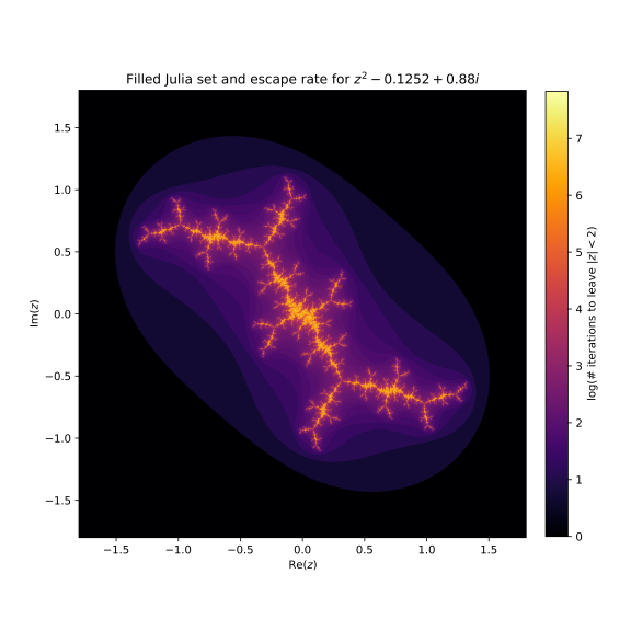
Write a program to use matplotlib (and particularly plt.imshow) along with code adapted from our Julia sets notebook to make a picture like this for c=1j and c=-1.7548776.
Working with files in Google Colab
As I mentioned in lecture, you don't need to install matplotlib locally in order to complete MCS 275 assignments. It is pre-installed in Google Colab, allowing you to use matplotlib in a notebook interface without installing anything.
However, in whatever way you use matplotlib, it is important to be able to save plots to files. Visualizations developed with matplotlib are often incorporated into other documents (e.g. research papers, reports). Writing to a file is easy if you install matploblib locally, but requires an extra step in Colab.
If you run Python code that writes to a file in Colab, the file will be saved to a temporary location (in Colab, not on your computer) that you can't directly access from outside the notebook interface. From within your notebook, it will look like the file exists and can be read back again. But once you exit colab, it will be gone.
To read and write files in Colab that are persistent and accessible outside of a single notebook instance, you can connect a Colab notebook to your google drive (associated to your uic.edu account, the same one that you use Colab with). Here is a demonstration of how to do it. This code won't work locally or in jupyter, but will work in Colab:
# Import the module to link to google drive
from google.colab import drive
# Make it so "/drive" refers to my google drive
# This will prompt you to allow google colab to access google drive, and ask
# you which google account you want to link.
drive.mount("/drive")
After running that cell in Colab, your entire google drive will appear as part of the filesystem accessible to the Python code you run in Colab, in a directory called "/drive/My Drive". You can upload data to drive and then work with it in a Colab notebook, or you can save results to files in Colab and then download them to your computer using Google drive.
By default, the notebooks you create in Colab are stored in a folder inside your google drive called "Colab Notebooks". In Colab, you would use that path "/drive/My Drive/Colab Notebooks" to access that folder. So, after calling drive.mount("/drive") in a notebook, a typical way to create a file in the same directory as the notebook that you can later download using Google drive would be:
# create a CSV file in colab that I can later download from google drive
import csv

data = [ ("n","n**2"), (1,1), (2,4), (3,9), (4,16) ]
with open("/drive/My Drive/Colab Notebooks/squares.csv","wt",newline="") as outfile:
    writer = csv.writer(outfile)
    for row in data:
        writer.writerow(row)
Challenge idea
If you're looking for a coding challenge related to the course material (but which isn't graded or collected), here's one that I think would be fun. It isn't meant to be a thing you work on in this discussion, but if you finish the problems listed above, you can read it and think about it a bit.
Use matplotlib to make a chromaticity tree visualizer. Use the (r,g) coordinates to determine node positions, so the whole diagram lives inside a triangle. (You could even apply a linear map to make this triangle equilaterial, rather than isosceles right, but that isn't necessary.) Draw the edges using either plt.plot or any of the other ways matplotlib supports drawing a bunch of disconnected line segments (some of which are detailed in this StackOverflow answer). Make the whole thing into a function which will take a ChromaTree as input and save an image of it as a PNG or PDF file.
(I considered either building this over Spring break to use as a demonstration, or assigning it as Project 4. I've decided not to do either of those things, but still thought it might be a nice project seed to share with you.)
Revision history
- 2021-03-29 - Initial publication